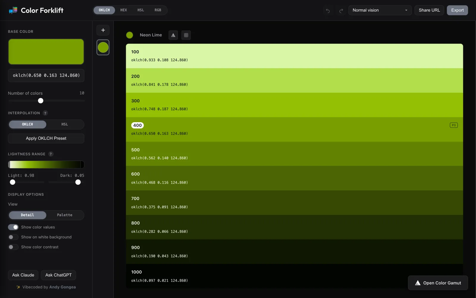
Even steps in HSL don't look even to people.
A color scale looks simple: pick a base color, then generate lighter and darker steps. Most generators do that in HSL, and HSL isn’t perceptually uniform. Yellows wash out, blues turn muddy, and a 500 in one hue looks heavier than a 500 in another.
Then the real work starts. You check contrast in one tool, check color blindness in another, find out a vivid step falls outside sRGB, and retype everything into CSS, Tailwind or a token file. Each handoff is a chance for the palette to drift.
The goal: one surface to generate, check and ship a palette, with nothing retyped by hand.
Perceptual by default, controllable when it matters.
Interpolation runs in OKLCH, so equal lightness steps look equally spaced. HSL is still one toggle away for people who expect it. The base color lands where it naturally sits on the lightness scale instead of being forced into the middle.
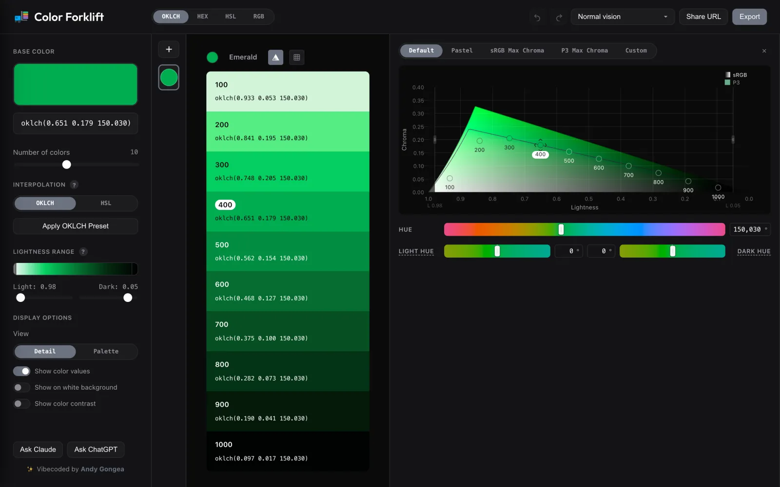
Presets cover the common intents: Default keeps the base color’s chroma ratio, Pastel softens it, and sRGB / P3 Max Chroma push each step to the edge of the gamut. Custom opens per-step lightness, chroma and hue rules. Hue tilt rotates light and dark steps up to ±30°, the way hand-tuned palettes warm their highlights and cool their shadows.
Show the color space, not just the swatches.
Swatches hide the most useful information: how much room each step has. The gamut panel plots every step on a lightness–chroma canvas with the sRGB and Display P3 boundaries drawn at the current hue. You can drag the base color, or drag single steps on the Custom preset, and watch the scale re-flow in real time.
Colors that only exist in P3 get a badge and export as color(display-p3 …). When a color has to fit a smaller gamut, the tool lowers chroma and keeps lightness and hue fixed.
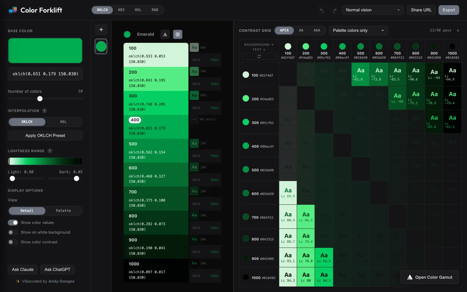
Contrast is part of generating, not a later audit.
Each step shows its best text pairing and a pass or fail badge right next to the swatch. You can check against WCAG 2.1 AA and AAA or APCA. The contrast grid then tests every pairing in the palette and shows the pass count, so you can see at a glance which pairs work.
A color vision menu simulates protanopia, deuteranopia, tritanopia and achromatopsia (Machado et al. 2009) across the whole interface, so you review the palette in context and not in a separate preview.
Ship the palette where tokens actually live.
Export writes directly to the formats teams use, with HEX, RGB, HSL or OKLCH values, as a download or a copy. The URL encodes the full state: every palette, its settings, custom rules, names and contrast mode. Sharing a palette is sharing a link.
- CodeCSS variables, SCSS, JSON
- Tailwindv3 config and v4
@themetokens - Design tokensW3C DTCG
tokens.json(Figma via Tokens Studio), Style Dictionary - WorkflowMultiple named palettes, drag to reorder, undo/redo, and keyboard shortcuts for every panel
The same color math, available to AI agents.
More and more palettes start in a chat, so Color Forklift runs a public MCP server at colorforklift.com/mcp. Claude, ChatGPT, Cursor and other MCP clients can generate palettes, check contrast, interpolate ranges, export tokens and return a share link that opens the result in the app.
The server uses the same color math as the UI, ported to PHP, so a palette an agent makes matches the one you’d make by hand. It’s stateless JSON-RPC with no sessions or streaming, which means it runs on ordinary shared hosting. Share links carry a ref=mcp parameter, so I can measure how much traffic agents send back to the app.
A complete palette workflow in a free web app.
- Palette presets
- 5
- Export formats
- 7
- Vision simulations
- 4
- Contrast models
- 3